Button - Question Type
Button questions types have been added to Design and to Produce, windows app and mobile apps, there is a Button icon in the toolbar and a tile icon in the tree view on the right-hand side in Design.

Options and features:


| Option | Description |
|---|---|
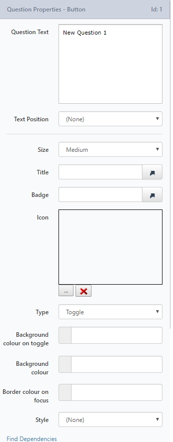
| Text position | Left, top, none as standard. |
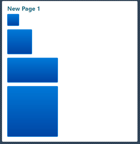
| Size | Small, Medium, Wide and Large are the options. They appear in the preview so the user can see how they will look. |
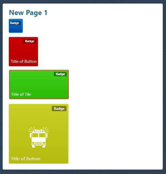
| Title | (optional) This is text that appears on the bottom right of the button. This shows in the preview. If the title is too long it will just be cut off - it does not wrap. |
| Badge | (optional) This is small text (75% of the title size) with a dark background that appears at the top right of the button. This shows in the preview. If the badge is too long it will just be cut off - it does not wrap. |
| Icon | This is an image that appears in the center of the button - if the image loaded is too large it will not appear centered and may overlap the title or not fit on the button at all. It is visible in the preview. |

Type has four options:
| Option | Description |
|---|---|
| Toggle | Allows for actions based on whether the button answer is selected or not. Button toggle color -** will replace the default blue of the button when selected - you cannot toggle the button in the preview, so you cannot preview this setting. |
| Open URL | Allows a URL to be entered, this URL will be opened in a browser when the button is clicked. Open In New Tab - Will open the URL in a new tab, if selected or will open the URL in the current tab if not selected. |
| Go To Page | Allows a page within the same project to be selected. The page will be redirected to when the button is clicked. |
| Go To Project | Allows a folder and then a project to be selected. The page will be redirected to the selected project when the button is clicked. |
| Option | Description |
|---|---|
| Button background color | This will replace the default blue of the button - shows in the preview. |
| Button focus ring color | This will replace the default blue of the button border change on hover - shows in the preview. This color does not show on mobile devices as there is no such thing as "hover" on a mobile app. |
| Style | This will insert a background behind the button. Styles can vary in color and size. |
Note
A color picker is used to select and show the colors for properties 6.1, 7 and 8 or you can enter a manual hex code.
If a custom CSS file is used with the various tile classes changed but using the same format as the default .css, then the default colors specified in the .css file for the buttons will replace the default system colors but will still allow the individual property settings for the question to apply. Applicable classes are .tile, .tile:hover, .tile-sm, .tile-md, .tile-wd, .tile-lg, .tile-badge, .tile-content, and .tile-icon.
When setting the button background in a CSS file you should include a gradient as per the following example background-image: linear-gradient (to bottom, #0078D7 0%, #0045A4 100%). If no actual gradient is to be shown, set the two colors to be the same e.g.: background-image: linear-gradient (to bottom, #0078D7 0%, #0078D7 100%).
Blurry Text
You might notice that some of the text on your buttons is blurry.

This can happen because there's a text shadow from the original base style. Adding the following to the CSS for that button will fix it.
text-shadow: none;
Conditions
Button Question Type cannot be used as a Condition
Updated almost 6 years ago
